09/02/26: Introductory session/start of live brief notes
Nicola Strina- games producer, started Blink in 2023.
Pivoted to a new strategy: focus on small games to develop a strong portfolio of games, 6 months – 1 year development cycle. Need a quick validation process.
takeaways: -validate ur idea early, – cut scope (start small!), -find a small and fun core concept and build a game around it, -quick development cycle, -aim for small budgets, -to further reduce the cost, consider government grants, tax breaks, outsourcing, -exploit existing IPs, they can bring in a built-in audience.
The Brief:
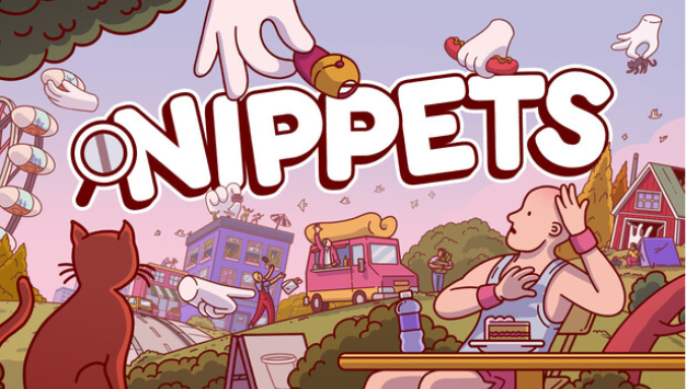
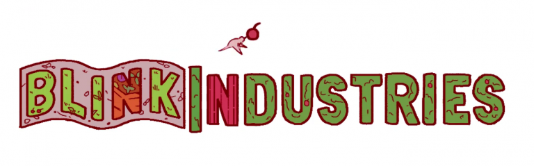
Logo Animation Brief for nippets
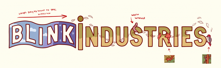
different groups for different seasons : spring -> summer -> autumn -> winter
animation should loop seamlessly
transparent bg
keep logo recognisable at all times- do not redesign it or turn it into a character
allowed: subtle motion, environmental effects,
managing scope creep- lots of spreadsheets and someone who can say no to ideas.
can you swap ideas? Is it just an idea? Does it require new features? Will it conflict with existing features? Does ur work with the existing ideas.
For this brief we were tasked with creating an animated rendition of the Blink Industries logo based around their upcoming game Nippets. I was relieved that it would be a group project as I am not an animator but was also excited to try it out. I teamed up with Daisy and Pelin, who are also from BA Games Art, and Kofi from animation. We initially wondered how good of an idea that would be considering 3 of us don’t animate but figured that with our adaptability and the power of friendship we would be able to figure it out.


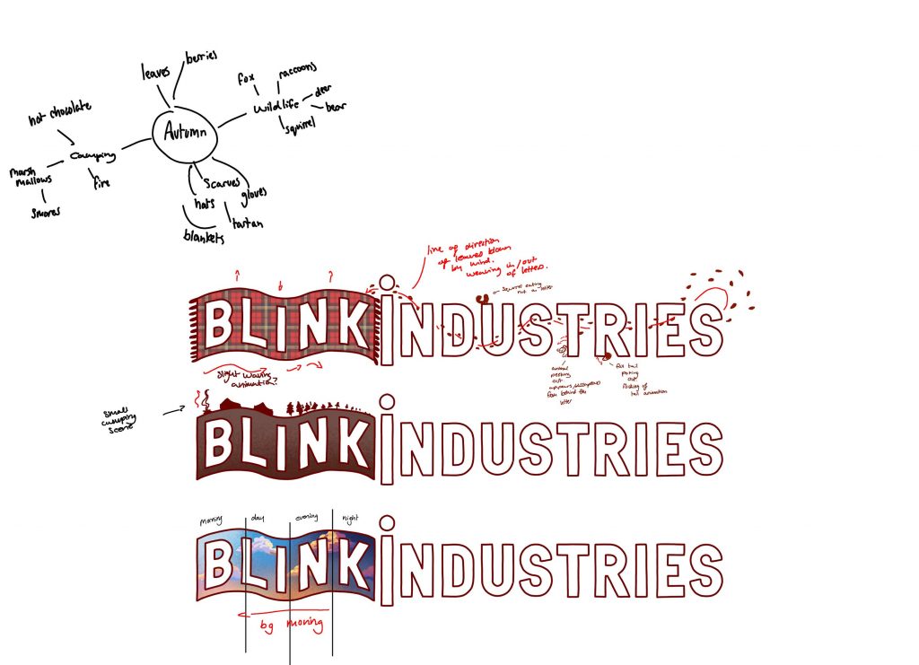
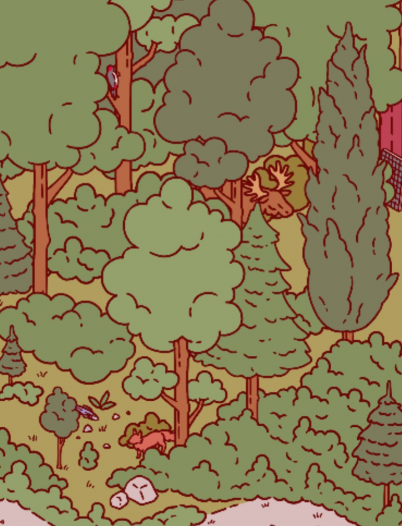
A key aspect of the project was designing the logo around one of the 4 seasons. Looking at these images as a team, we decided to work around Autumn as we found it to be the most visually interesting.
After this introductory session we created a group chat room for us to communicate through on Discord so we would have a place to call and send images to.
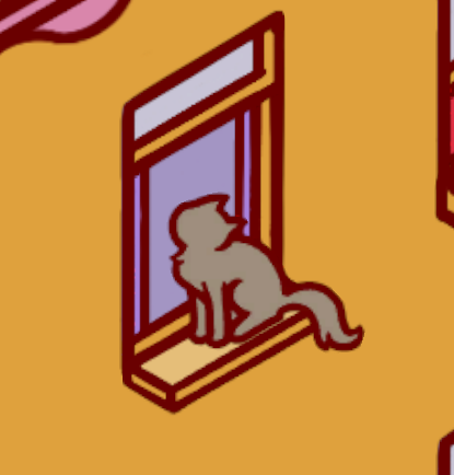
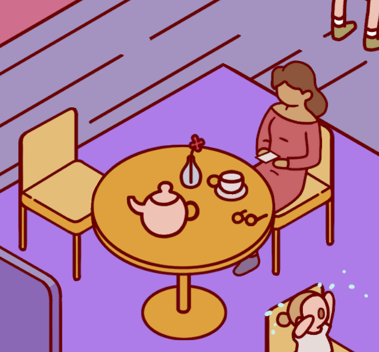
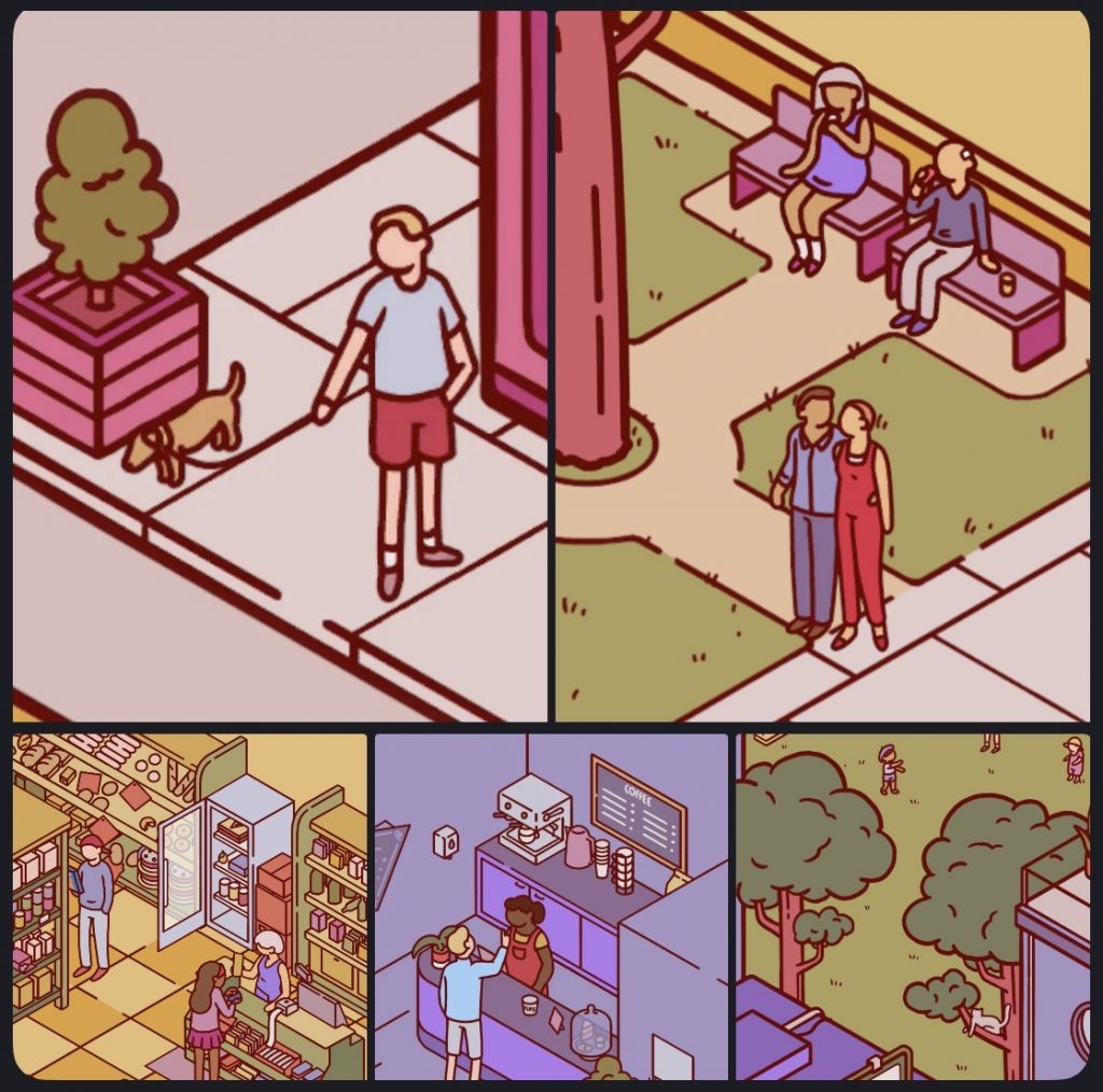
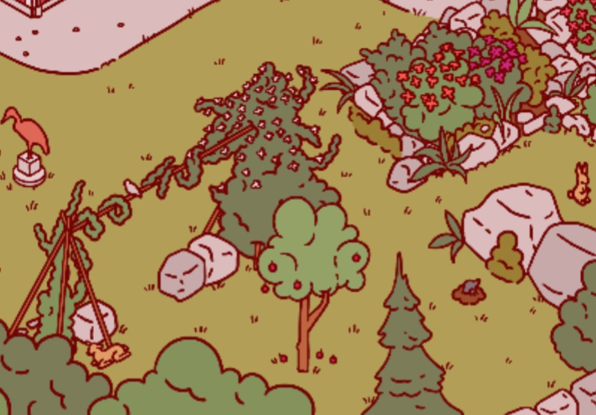
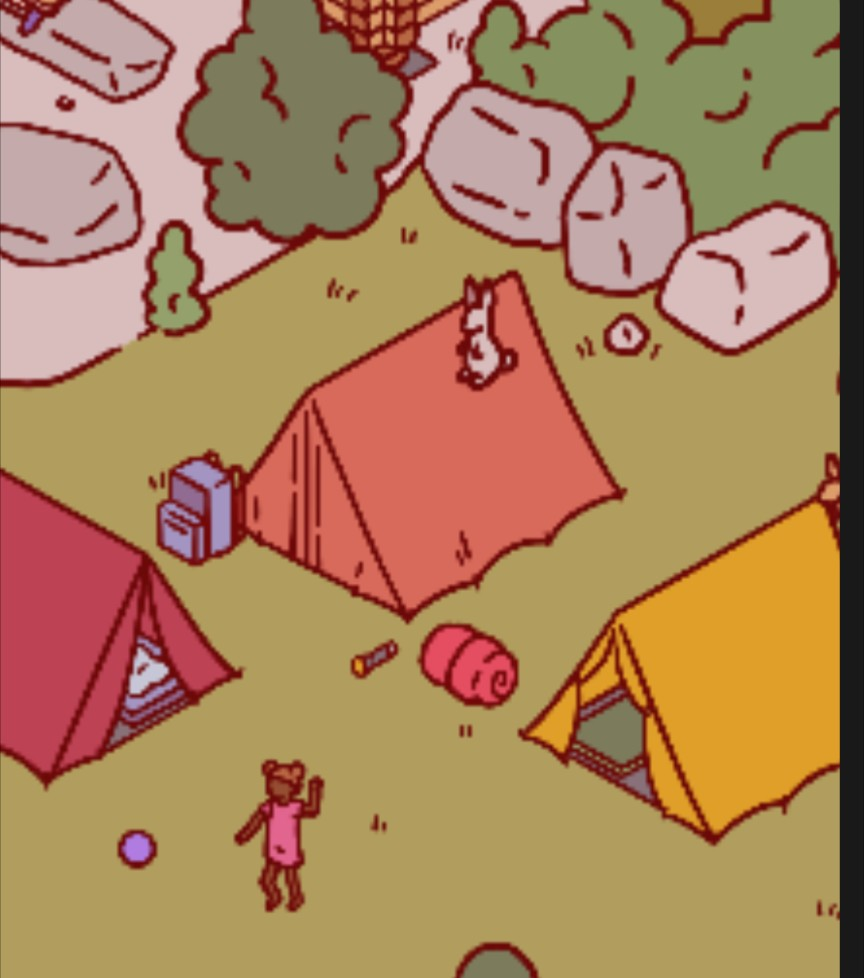
Before working on iterations, Daisy played the demo of Nippets and sent over various screenshots we could use as a style reference. While these were taken from the Spring scene, they helped to introduce me to what the game looked like and give a good sense of direction into the kinds of things we could include.
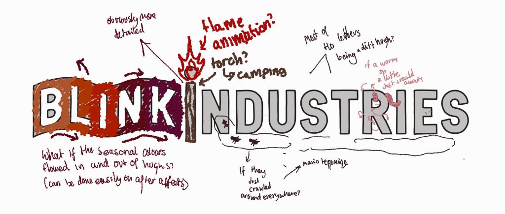
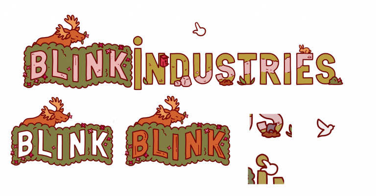
I created 3 different versions of the “Blink” but struggled to think of more ideas for the rest of the logo. In these sketches I was focused on ideas and so didn’t try to match the Nippets art style.
In her design Daisy incorporated elements from mine and Kofi’s design but in a way that felt true to the Nippets style. It was also nice to see how she took specific elements from the Autumn illustration and added them.
Throughout the brief we had weekly 20 minute sessions with Joshua on Microsoft Teams where we could talk to him and receive feedback. We took these designs to our first call and received the following feedback from him:
- tie the ideas into the company’s identity
- increase saturation and work on contrast values
- choose statement colours- colour pick from the reference image
- consider different movement styles + effects and textures
and above all
- create more designs!!!
In this call he also gave us feedback for when we eventually pitch our ideas to Nicola, in relation to the way we should introduce each other and hand over to the next person.
After this session we spent the week developing new ideas. Based on the feedback Joshua gave and seeing Daisy’s work I took a closer look at the Autumn image and directly incorporated some of the things I could see.
My concepts:

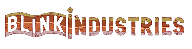
For these iterations I tried to replicate the art style of the game which I think made these much more effective.
We compiled all of our ideas into another slideshow and presented them to Joshua a final time before presenting them to the client where he was able to provide us feedback on the designs as well as how to structure our pitch presentation.
Joshua felt they were very cohesive and much more tidied up compared to before.
The feedback I received for my designs was that the first 2 weren’t very transformative which can act as a safe option for a client when presented alongside a more transformative option. Joshua said the camping design was very effective but questioned how much animation it would have as it’s currently easy to read but lots of animation could make this less legible when moving so potentially not to animate the blink part.
The feedback we each received helped us to decide which ones we wanted to present in our pitch as we was recommended to only show around 5.
PITCH
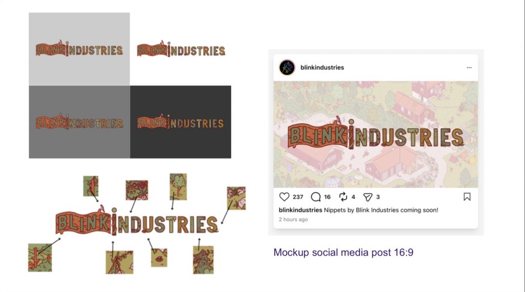
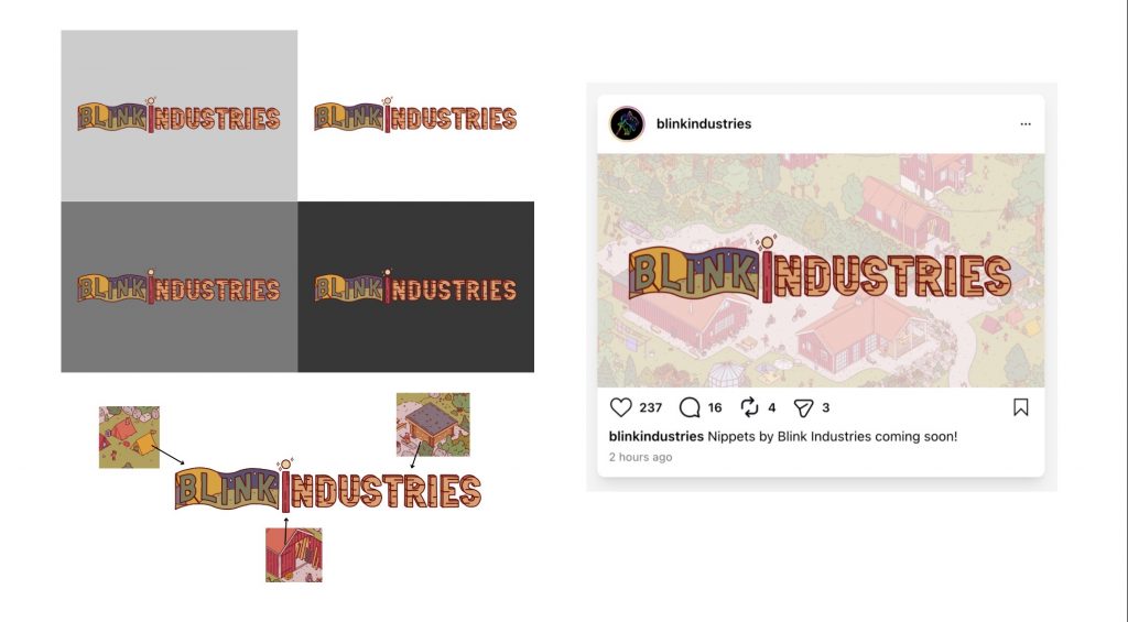
For our pitch, we adjusted our presentation to only include 5 of our designs, as well as what they would look like on different backgrounds + social media. As everyone else had created animations we also included those as embedded videos.


Before the pitch I updated my camping iteration to develop the ‘industries’ part further as it was left plain before. I had always struggled with that part of the design because it was only text and I used the flag shape behind ‘blink’ to develop ideas for that half. I returned to the Autumn image and ultimately decided to keep it simple by just using the wood shed panels. I tried to make it more interesting by drawing in the sides to give it a 3D appearance.
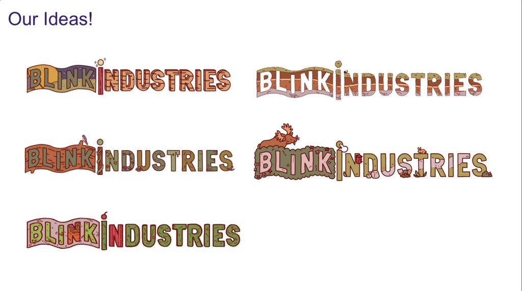
Overall I feel these 2 designs continued not to be very transformative, as Joshua said before. However I think they were a good alternative compared to Daisy’s much more busy Moose design. Having a range of detail helped us to provide the client with different options to choose from as we wasn’t yet sure how busy they may want the logo to be. For future practices I would like to work towards creating a varied set of designs like that myself as each of my designs ended up being quite simple.
Out of our design’s Nicola was drawn towards Daisy’s so we decided to use it as a base to build upon for our final design. He noted how there was no people in our design and recommended animating someone walking through the letters, along Daisy’s path.
After this point we worked towards combining different elements into a more busy design, as it was noted that we could have more going on. We started this by each creating some additional sketches
Before creating these we had a call which helped us to determine the direction we wanted to take as well as the imagery we wanted to include.


We presented these new versions to Joshua who gave us feedback but mainly suggested we move onto creating our final design to animate.
When showing him our final combined logo he was able to bring up issues such as with the clothing line going behind the letter gaps affecting the legibility and making it looked clutteredWhile these were all small changes they helped to make the piece more pleasing to look at.
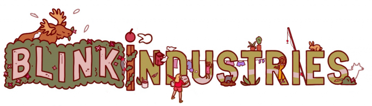
Daisy added these changes based on the feedback we received from Joshua, changing (and partially removing) the placement of the washing line as well as removing some of the objects on the grass. The rabbit also moved letters to provide more space between it and the fishing pole. These changes helped to declutter the design and make it clearer and more legible.
ANIMATING
Before we started animating the logo we delegated the tasks out, so we knew what each of us would be working on. Initially we had planned to divide the work into different roles and have 2 people draw the keyframes and the other 2 do the in-betweens. We ended up instead assigning different parts of the design to different people then collating them all together afterwards as it meant we wouldn’t have to wait on people to finish, making the process faster and easier.
I worked on the 2 children passing the ball back and forth between each other. Going in to this I knew I would be using keyframes as I found it more comfortable to animate that way over frame by frame.
For keyframe animations I have previously used After effects when using a computer, and Alight motion when using iPad. I knew I would use my iPad as I could work quicker that way but encountered problems with Alight motion when using it before. A friend recommended I true the app ToonSquid as it supported keyframe animating (as well as frame by frame). I had previously heard about this app from several people so decided to work with it for this brief.
Daisy sent us a copy of the logo with all the assets separated. This made it easy for me to import them without having to track down the original assets myself. The only thing I had to do was to ‘cut up’ the assets where I wanted them to move, aka where the joints were. I was able to do this in Toonsquid as it allows for drawing and erasure of the assets which I found very convenient.
Daisy was our compositor for the project so put together everyone’s contributions. After watching the animation put together, I thought the ball movement felt off and checked in to see if anyone else felt similarly. Daisy agreed and when she looked into it found that in a couple of the frames the ball went backwards instead of forwards. To date I still have no idea why this was. To resolve this I redid the ball movement by removing the existing keyframes and adding them again. In addition to this I also worked on the timing of the movement as it felt like it was in place for too long before.
These changes worked and we all agreed the ball was a lot smoother now.
After adding the new ball animation this is what our final animation looked like:
Reflection
The project went very well and allowed me to learn more about animation. I found working in the Nippets style to be quite refreshing as it was quite simplistic and a nice change from what I’m used to. The weekly feedback sessions with Joshua really helped to develop my ideas as well as instil professional practices in me such as how to pitch and developing iterative designs more extensively.
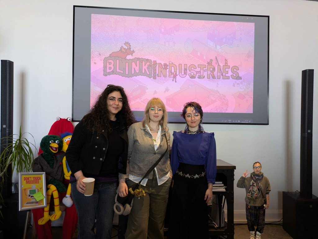
We were able to present our final animation at their studio and receive final feedback from Nicola. He noted how he liked some of the elements, such as the bird swooping down, although noticed that the people I had animated were done incorrectly. In the Nippets game they use keyframes for objects but frame by frame for people. We were able to make adjustments to our animation before they would be posted online by Blink so Kofi re-animated my contribution as frame by frame. This feedback highlighted the importance of checking the brief as well as researching the material properly. Had I done so, I could have avoided making this mistake.
