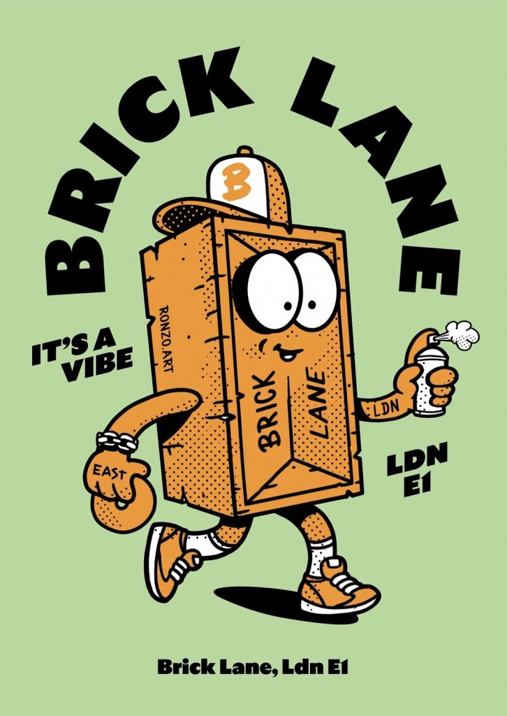
For this brief we were going to make a playable game demo in collaboration with Purr Point productions and anything world, using Ronzo.art’s Brick Lane mascot.
The brief offered the chance to work in either 2D or 3D, with 2D artists creating in game murals, and 3D artists designing and creating assets for the game. As a This brief reminded me a lot of the collaborative project we had in year 2 with BA Games Design where we worked together to create a playable game in small teams. This made me curious about how different this project would be and I was excited to gain more experience relevant to my course (BA Games Art).
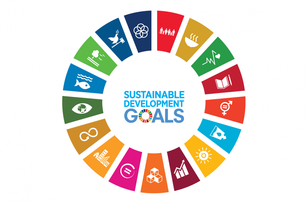
As I want to be a 2D artist I decided to only be a part of the 2D team. In one of our first online briefings on teams for this brief we found out we would be creating 17 murals total, each based on one of the UN sustainability goals. This made me SO excited as it turned a games art brief into an illustration brief! I previously did illustration in my foundation year so I was very interested in this project.
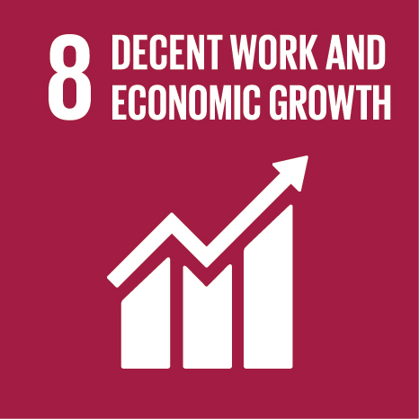
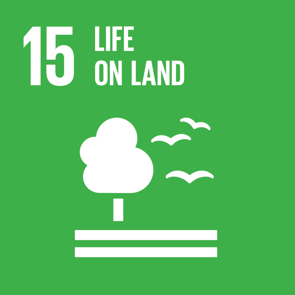
My 2 sustainability goals were 8. Decent work and economic growth and 15. Life on Land. While we had the chance to select which of the goals we wanted to work on ourselves, I decided to leave it up to Maliha to select them for me as I enjoy the challenge of potentially working with something quite difficult and if I were choosing them myself, may try to opt for an ‘easier’ sustainability goal.
While the goal was for these pieces to be used as murals spray painted by the mascot, we were allowed to follow whatever art direction we wanted and to focus on creating something that would benefit our portfolio.
initially I had wanted to stay true to this theme and in my mood boards gathered visual references of different graffiti.
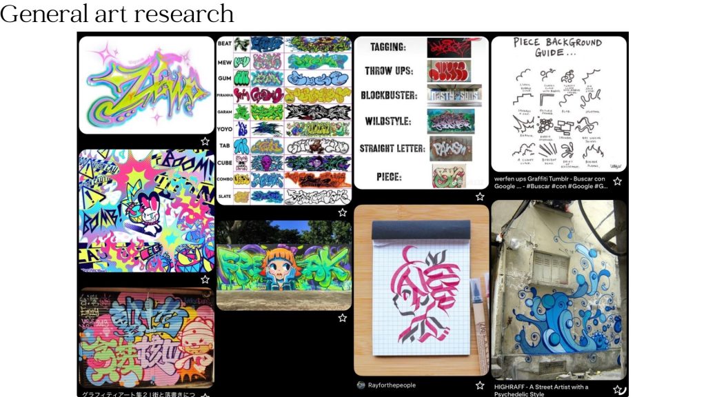
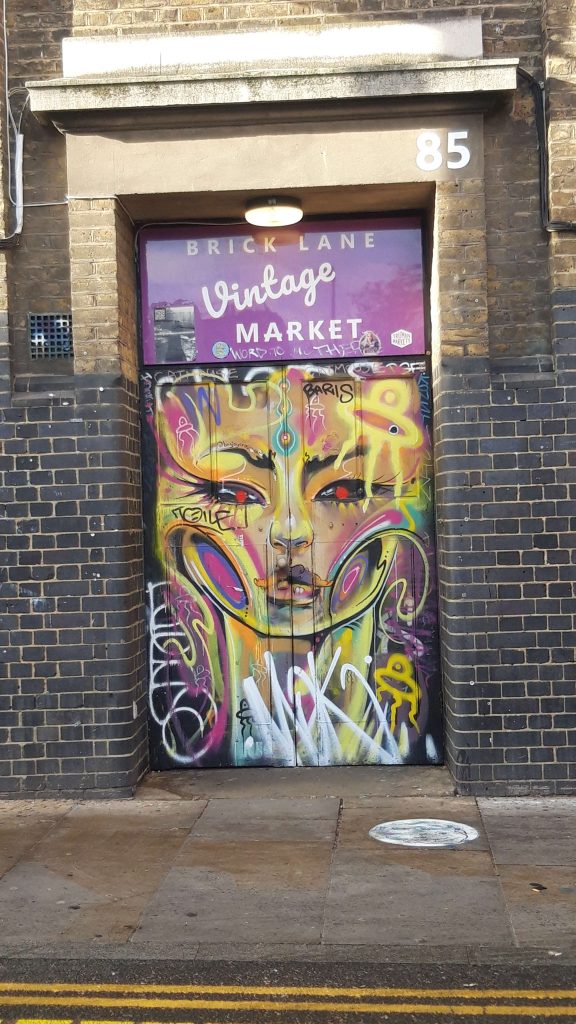
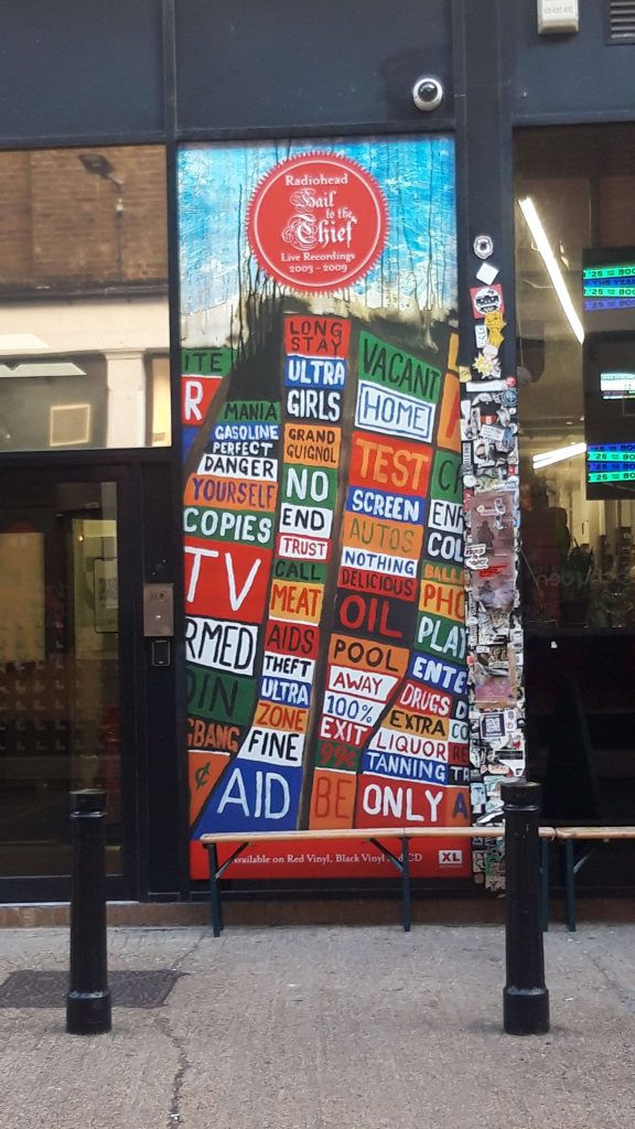
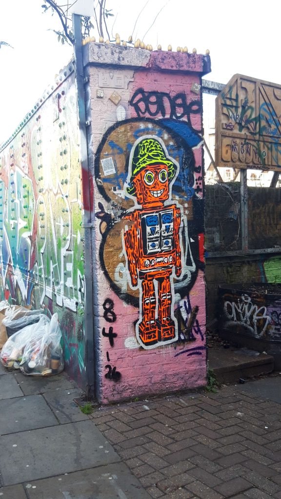
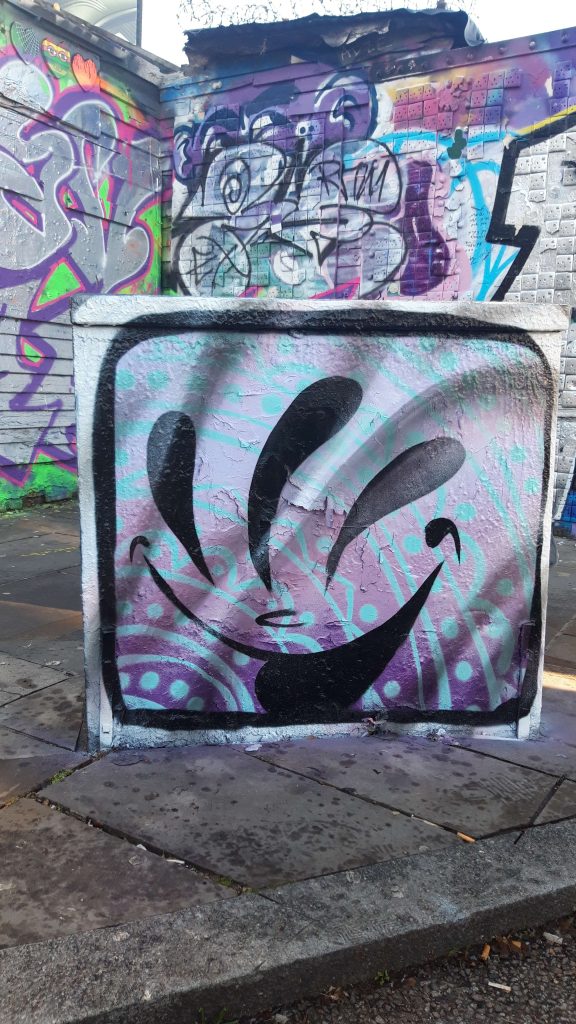
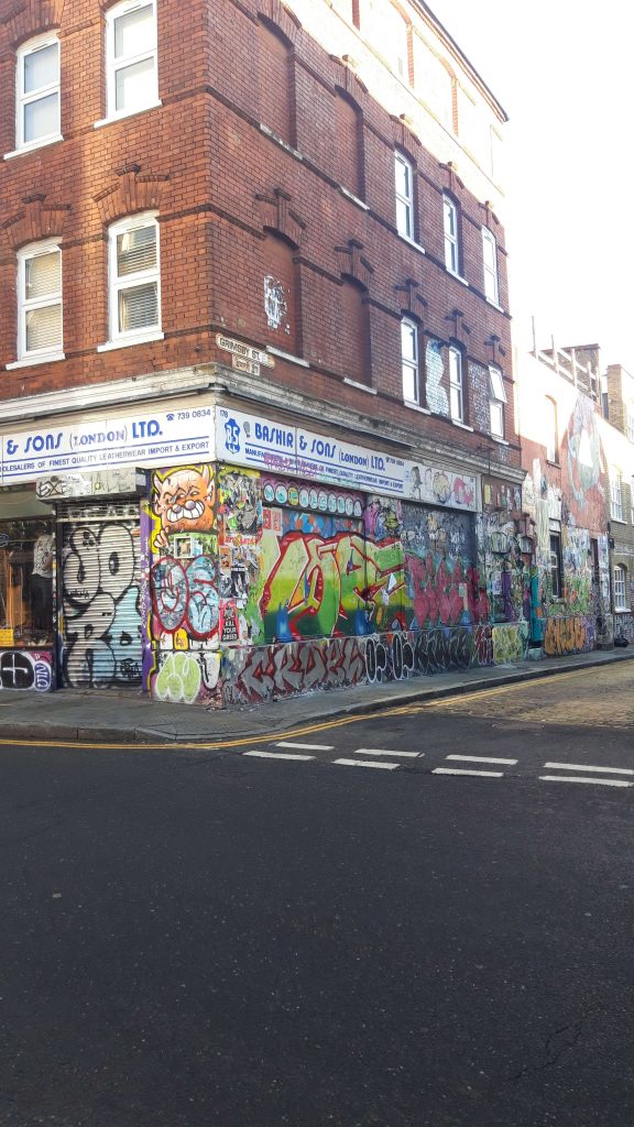
Before working on the murals, I went on a student led trip to Brick Lane where we all took different photos of the area. I found this useful as I was unable to attend the previous trip where we had the chance to meet the client. The visit gave me an idea of what the location looked like that we were basing the in game location on as well as the kinds of graffiti and art found there.
This trip also highlighted the wide variety of styles seen in street art which made the concept of everyone using different styles feel even more authentic.
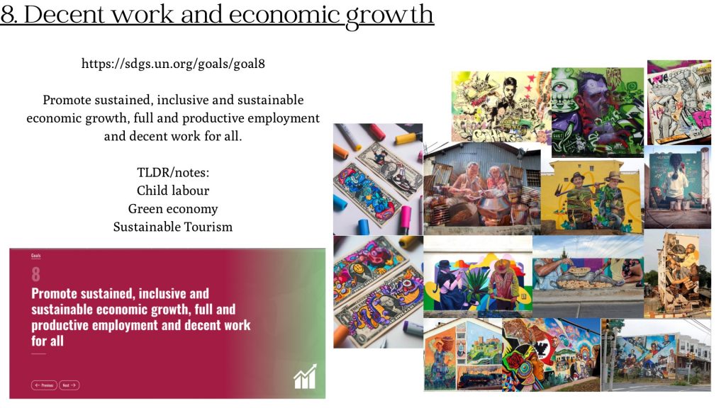
8. Decent work and economic growth.
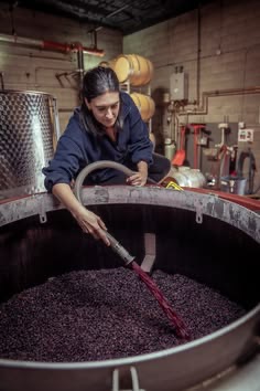
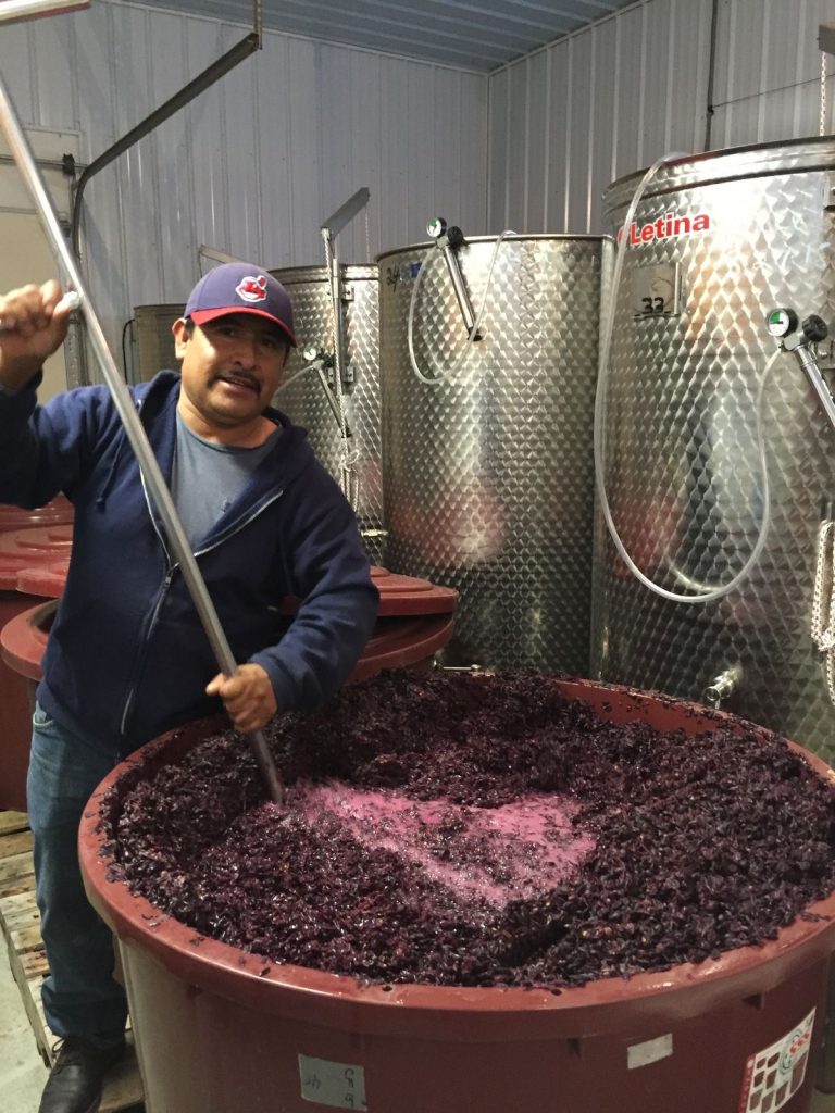
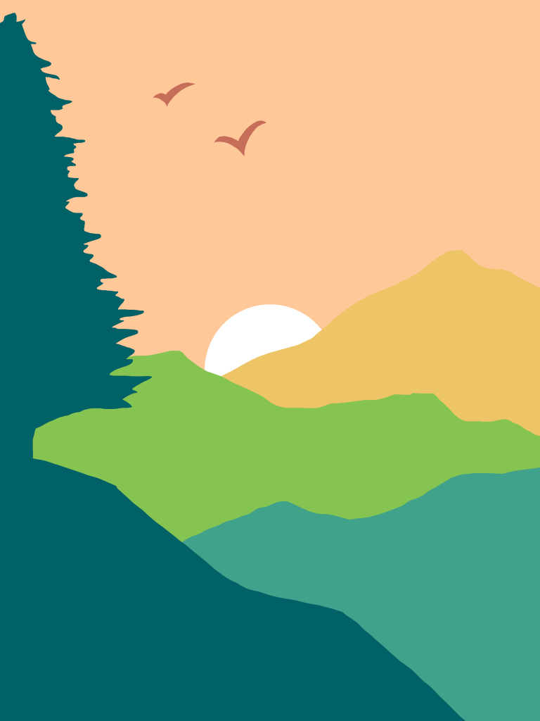
For this mural I wanted to spotlight how labour from other countries is what makes up our economy.
Going into this I was initially a little stuck on how I would represent this sustainability goal but after brainstorming and sketching different things out I was able to come up with the above concept.
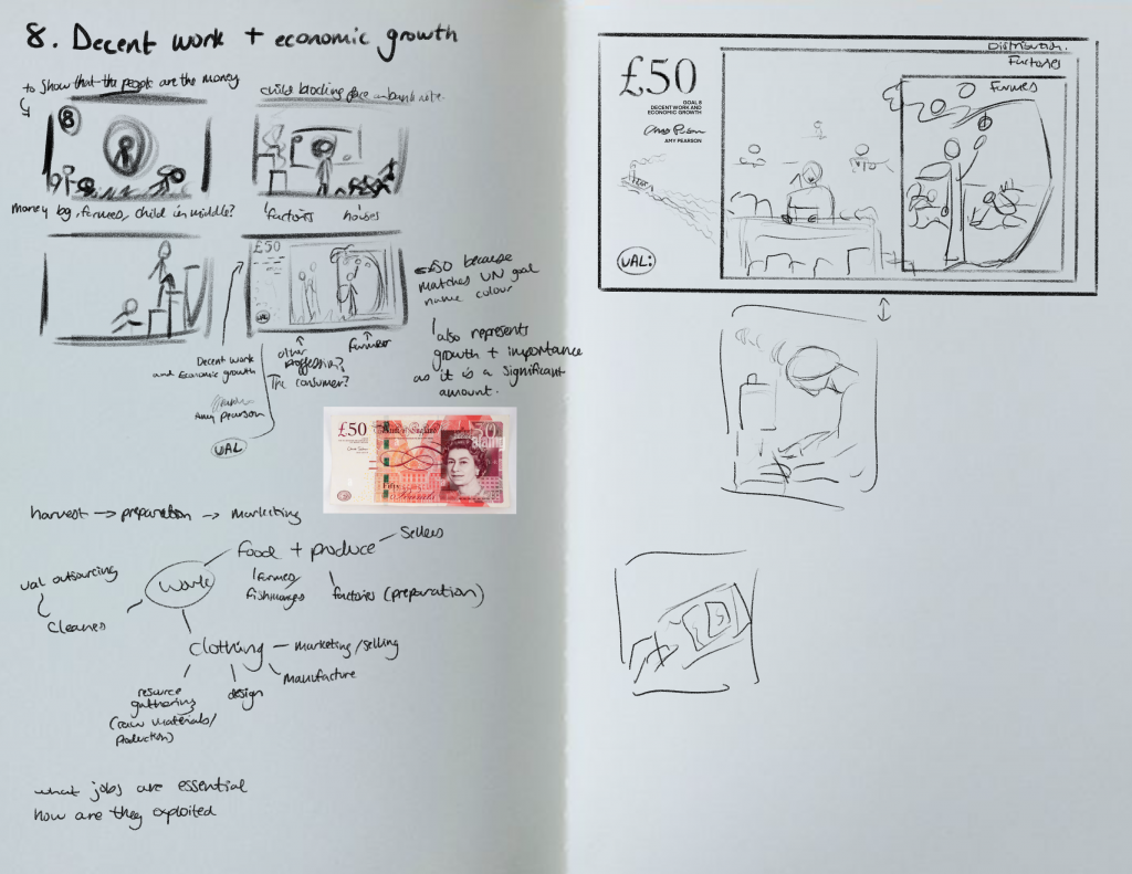
To develop the concept further I used photobashing to put together my idea, and combined different photographs. This is what I presented in one of our online catch up sessions on Teams.
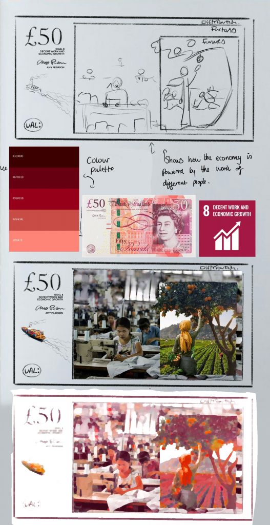
In this session I received valuable feedback which changed the direction I was taking the piece. Maliha told me it looked very well researched but suggested I make the direction more specific and that instead of focusing on the journey of different products, to just choose one. In my concept I had included farmers and factory workers. I did this as I feel they are both under appreciated and lack recognition as they are out of sight in the final product, but as a result came across as a little random as they are not connected. The centre image of the lady picking the fruit from the tree was considered quite strong so I built my research off it.
As I wanted to keep that part of the mural, I began to research into fruit importation into the UK to see which were the highest.
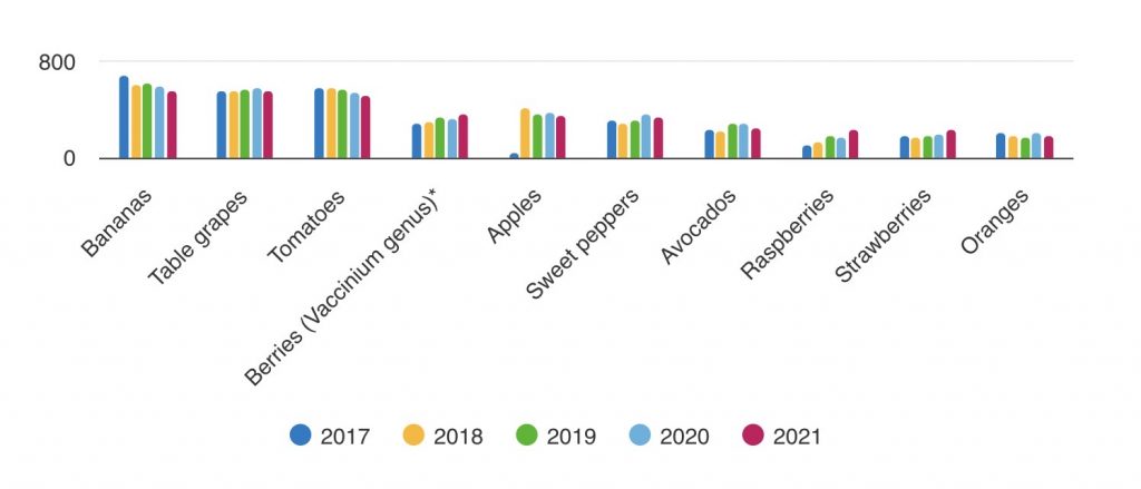
This research surprised me as I had expected for apples and oranges to be higher.
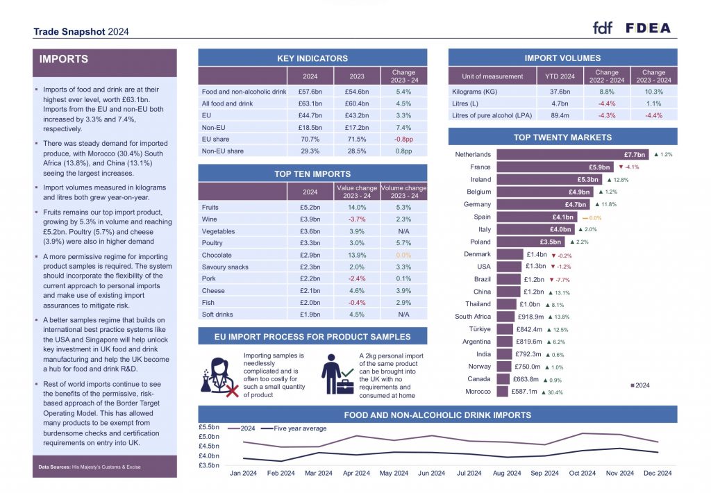
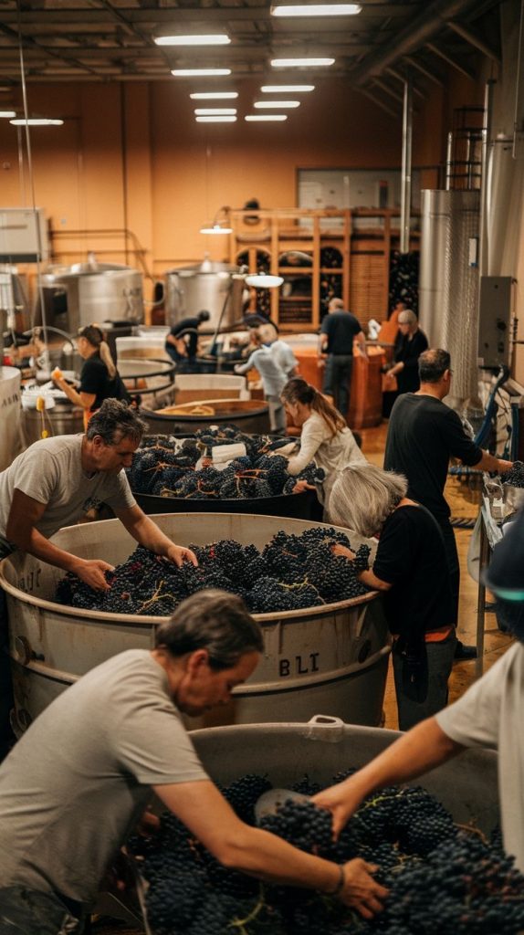
When looking at this trade snapshot from FDF I found wine listed at the second highest import in 2024. This made me choose to look at wine production as it tied in with grapes being among the most imported fruits into the UK.

By photo bashing, I created another new image for my mural. While I have had a little experience in doing this, creating my images with this technique for my murals helped me to gain practice in doing so and to feel more confident in doing it in the future. I intend to continue using this method in the future as it helped me to create and develop interesting compositions.
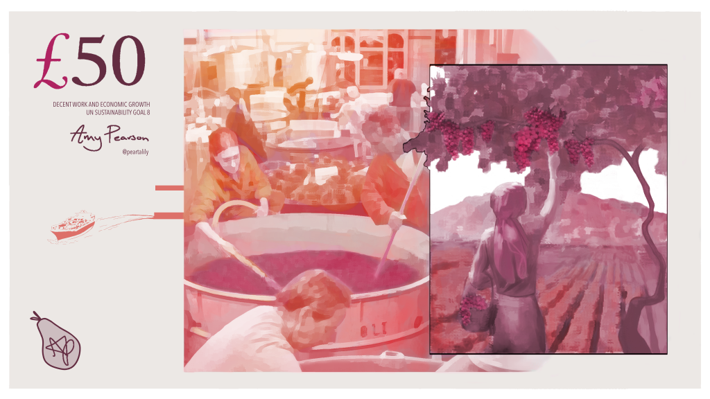
For the final mural I deliberately chose to leave it as an edited version of the photo bash as I felt it matched some of the mural styles in my moodboards and looked quite painterly. Reflecting on this now, I wish I had attempted to recreate it or build on top of it with my own style as it may have made it more interesting or original.
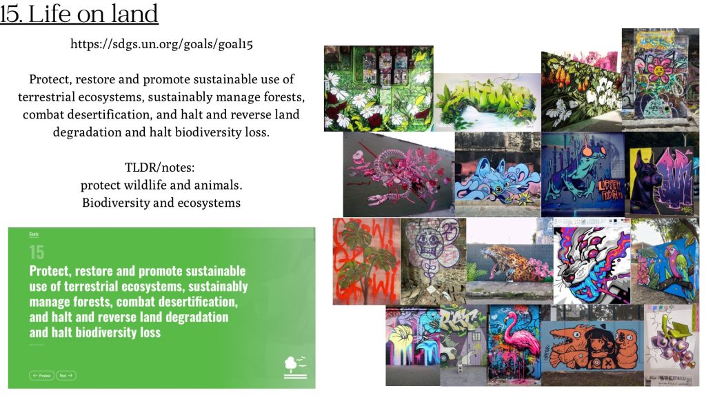
15. Life on Land
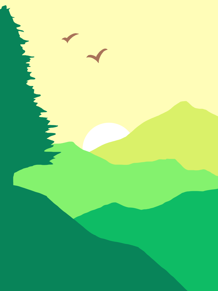
In this mural I wanted to raise awareness for endangered species. I had this idea very early on and didn’t struggle much with generating ideas as I had before in my other mural.
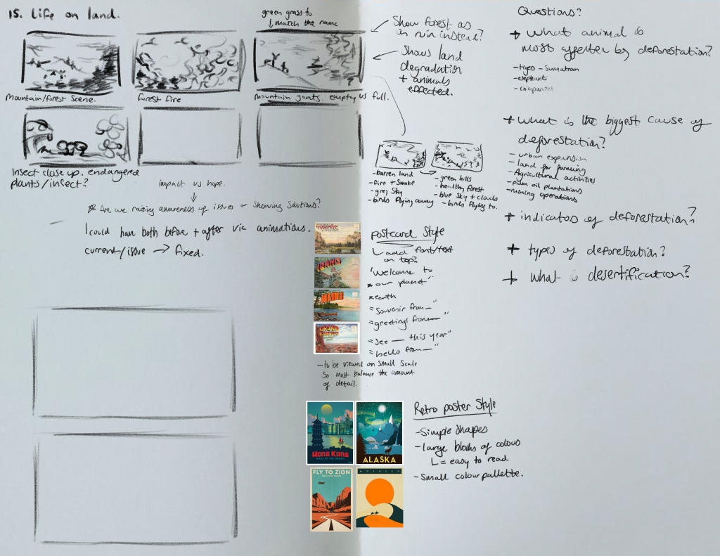
My concept developed further as I started taking inspiration from vintage and retro postcard and poster designs.
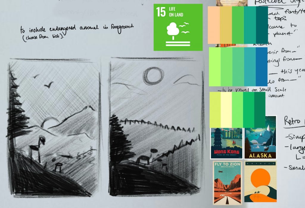
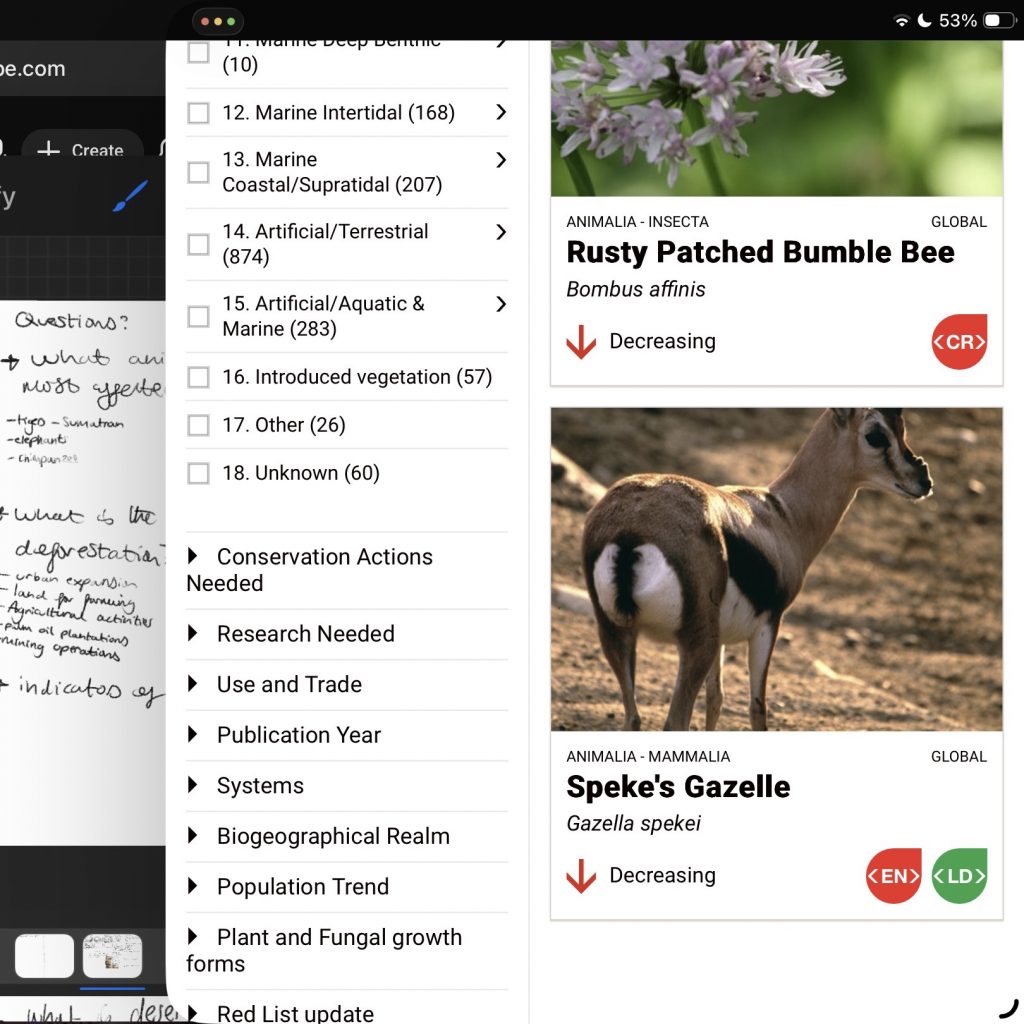
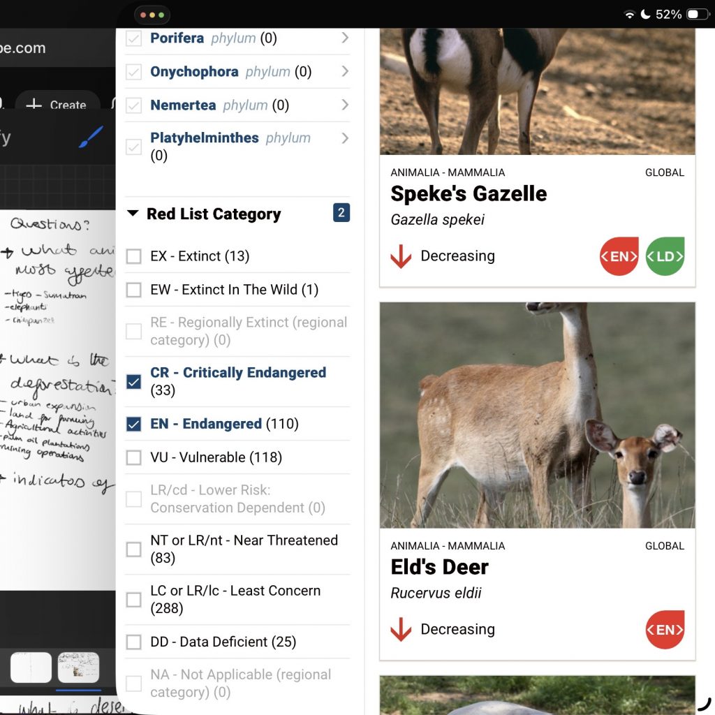
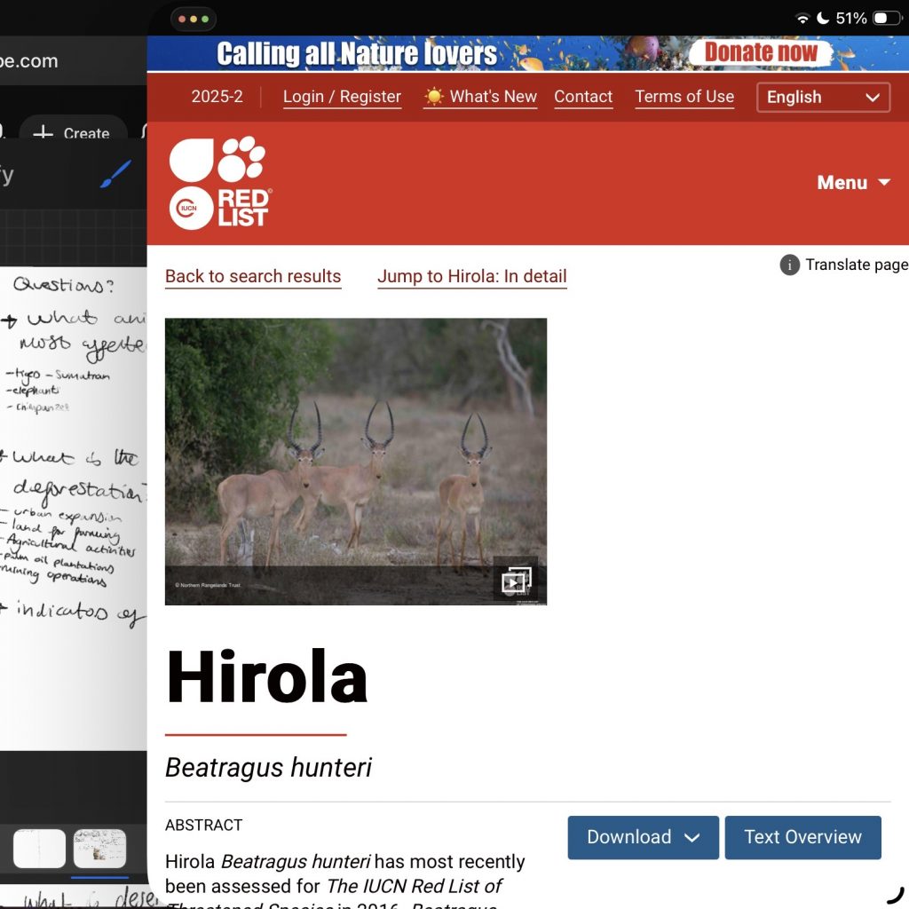
During our Teams call review I didn’t receive much feedback on this piece so I began to develop it further by doing more research. Up till this point I had carried out my research using the IUCN Redlist website where I used the filtered search to find different species that were at risk of going extinct.


When creating the final version I stuck to the solid colours and clean edges I saw in my references, achieving this through the fill in lasso tool.
I experimented further with the colours and asked for feedback from friends to gauge which one people preferred the look of.
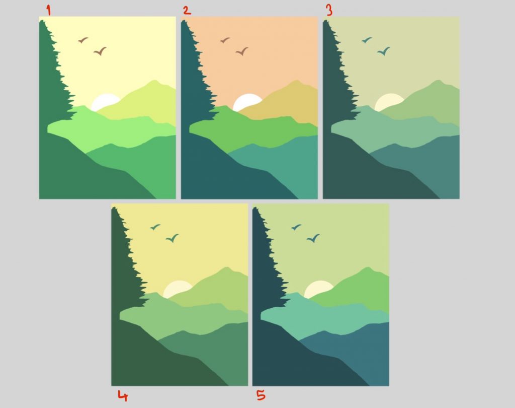
To my surprise everyone (5 people) voted for number 2. I had expected the votes to lean towards 5 and to my credit, 2 people threw that one into their vote as a sort of double vote, but I was still shocked by how number 2 was consistently chosen every time. Usually when asking for feedback I receive a mixture of responses which vary slightly, but this time it was very definite. When trying to figure out why, it all boiled down to the same thing, the sky’s contrast, which made a lot of people’s eyes be drawn to that option first. This was useful to me and is something I will keep in mind for future projects, to include a contrast colour to help maintain cohesiveness and visual appeal otherwise the image may become ‘boring’.
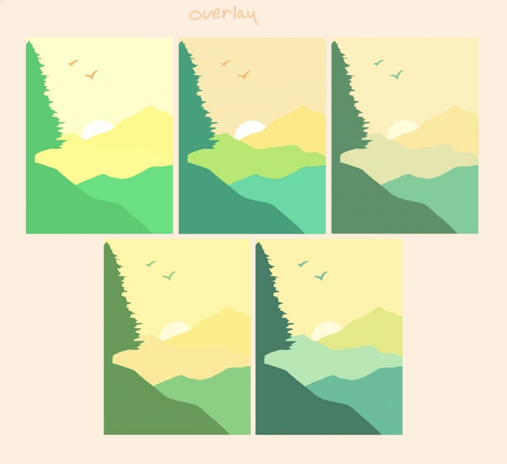
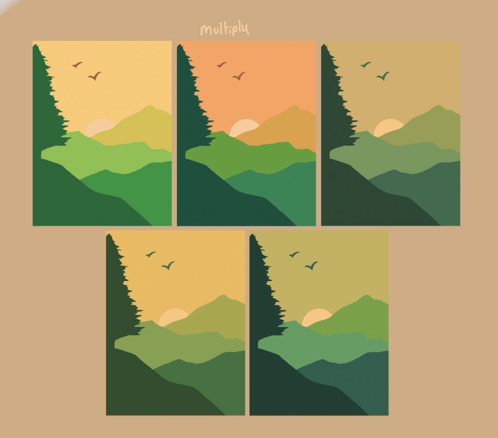
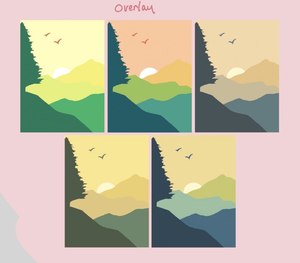
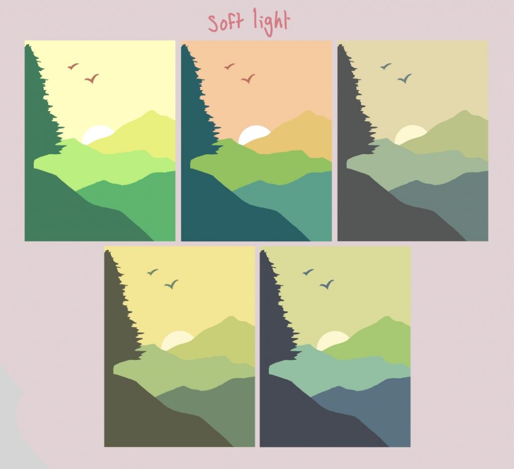
Upon one of their suggestions I played around with different blending modes to alter the colours slightly, and ultimately ended up using number 2 with overlay on a lower opacity as it added a slight warmth to the image.
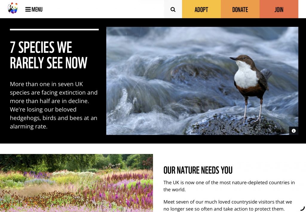
After working on my previous mural I decided to approach this one differently from my initial plan and zoned in on Goal 15 in relation to the UK. This would make more sense as the context of these murals are as if they are being spray painted in Brick Lane. When looking into endangered species I came across this list by the WFF which outlined 7 species we don’t see as often in the UK.
Using this, I created a sketch of the new details I wanted to add.
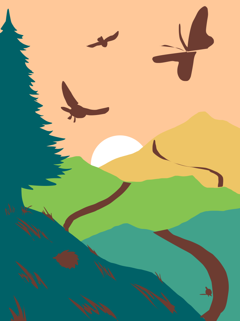
The animals I included from the list are:
- Water vole (bottom right)
- Hedgehog (left of foreground)
- Grasshopper (under tree)
- High Brown Fritillary Butterfly (top right)
- Hen Harrier (Centre top)
- Barn Owl (top left)
Ultimately I ended up taking the water vole out as it felt oddly placed. Removing this and keeping the animals in only 2 sections (1st hill + sky) made the composition more cohesive and less scattered and busy.
Initially I had intended on keeping the animals in solid colours, but after sketching the outline when refining the previous block-outs I couldn’t help myself and gave into roughly sketching in the rest of the details.
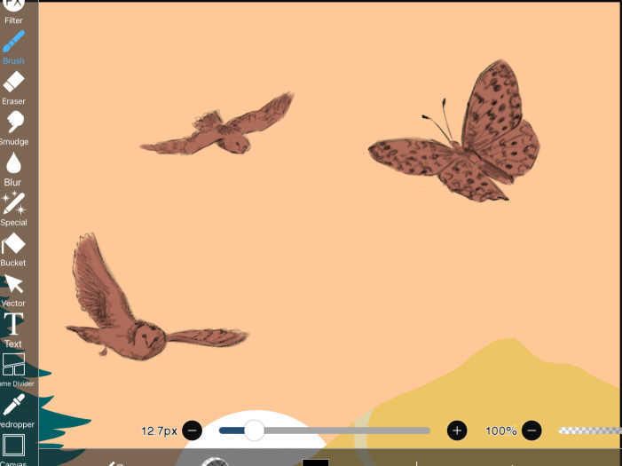
With my usual style I would then begin to render in all the details however quite liked the contrast. Admittedly it was a little hard to leave alone as I was bothered by small details and lines being ‘wrong’ but chose to power through and ignore it because from a distance it likely wouldn’t be noticeable. This helped me to work faster as I usually worry too much about the small things that others won’t pick up on.
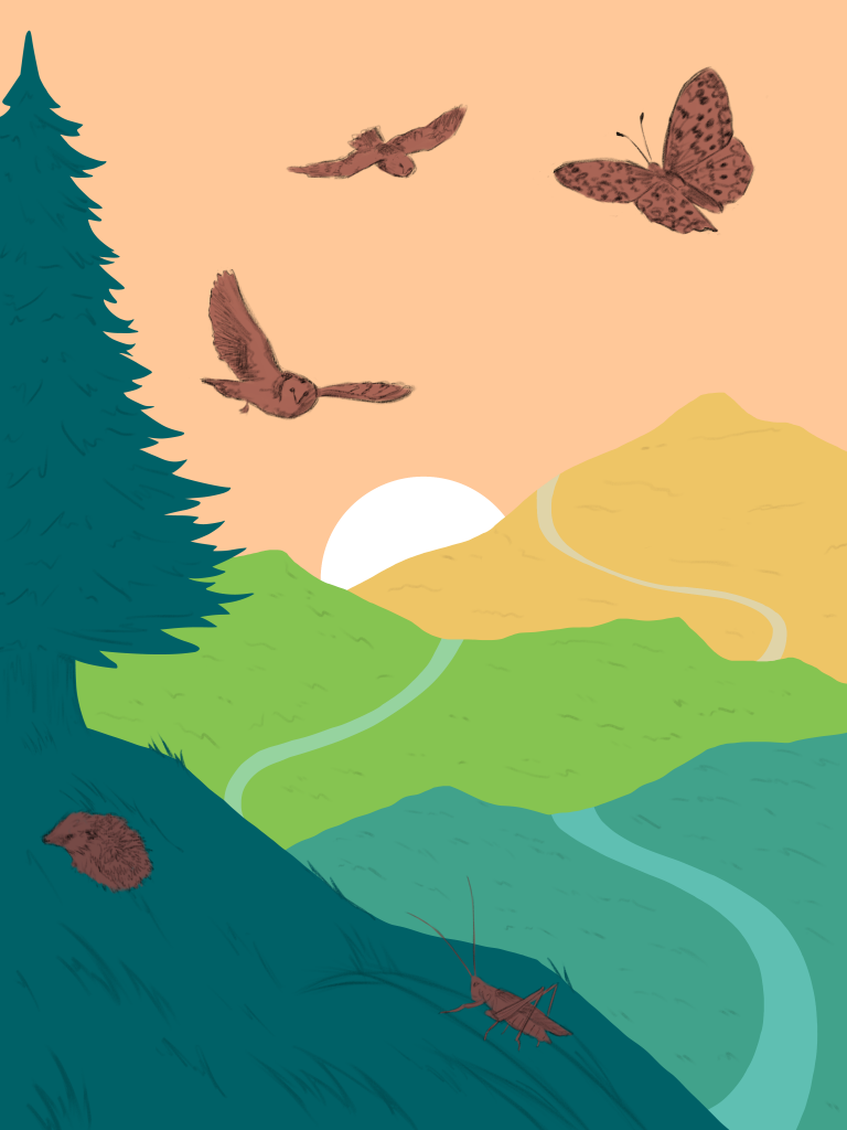
In the final mural I moved the grasshopper as it wasn’t easily identifiable when under the tree due to the small size. Despite removing the water vole I kept in what was originally a river as it helped to break up the solid blocks of colour and provide visual details.
When adding in the grass across the hills I did it without much thought, my only intention being to make the hills more obviously grassy rather than the mountains they looked like previously. I was expecting that when I zoomed out I would be made aware of how much of an eye sore it was, but, to my surprise it ended up looking quite good. Moments like these showed me the importance of experimentation and working in ways that made me uncomfortable, as each time it only served the strengthen the outcome.
Reflection
Throughout both halves of this brief I was very deliberate with how I designed each mural, down to even the colour palettes where I incorporated the colour of each goal into their respective mural. While I regret parts of my first mural in relation to its execution, I adore the second one and so feel the project was successful. This has been the most research heavy project I have worked on and it gave me the chance to try a range of techniques I lack heavy experience in (photo bashing, lasso fill). I enjoyed working on a brief that reminded me so much of my illustration foundation year and would like to continue thinking about how I can bring attention to important issues like the UN sustainability goals through my artwork again in the future.