I reached out to help on a student film that had been advertised in the DPS student char. The project was an animation student’s final major project called Heartbreak the Gameshow, a depicting the conflict between Hades and Persephone in the format of a games show ran by Cupid.
During the call out they were looking for a range of support and helpers such as with 2D backgrounds which I reached out for as I have had previous experience in doing them, albeit not for animation. I was excited to be a part of this project as I haven’t helped out on an animation project before and the concept seemed quite fun.
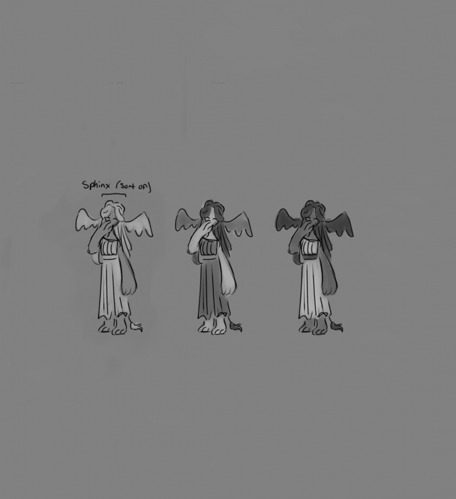
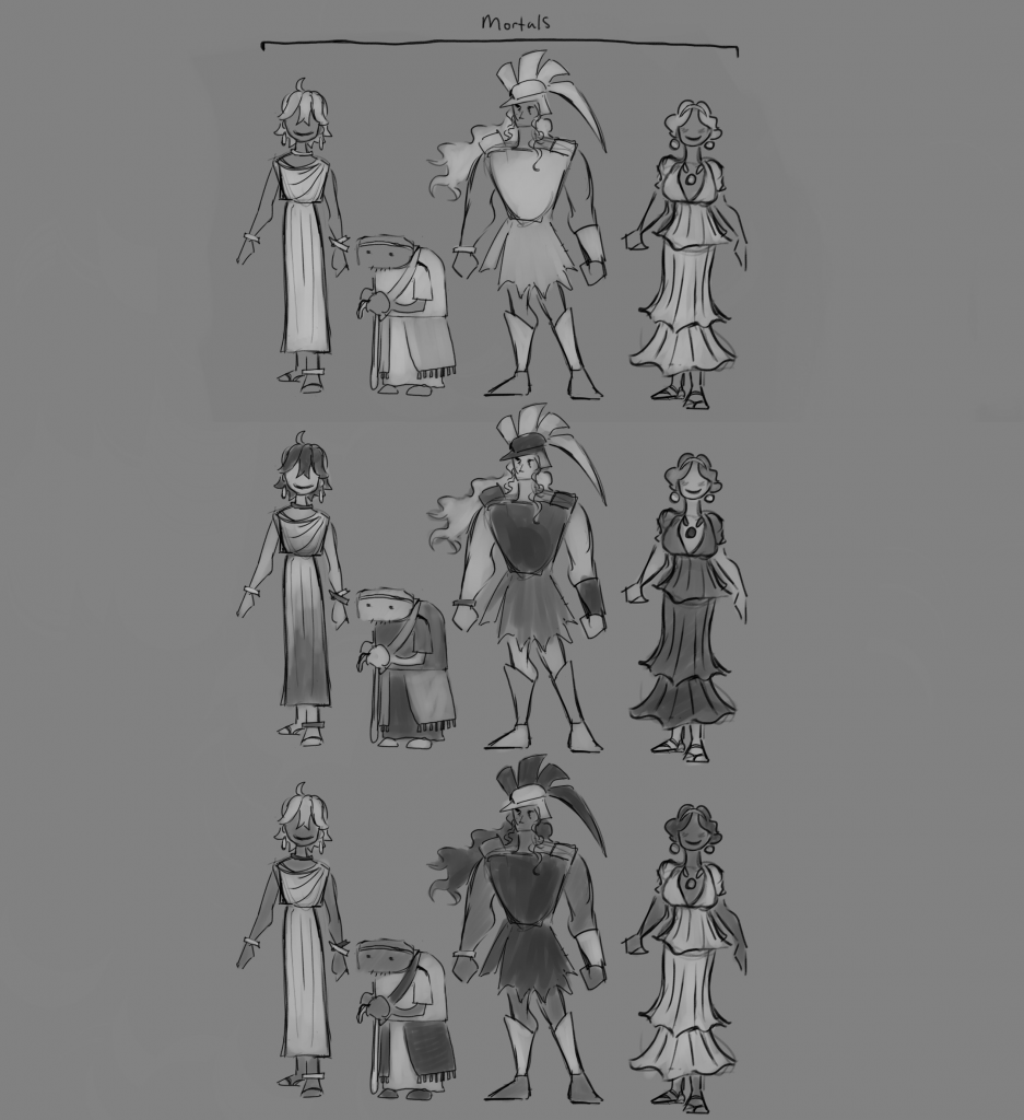
Audience Designs
Once I joined the project I was added to a Pinterest board where I could see and add images relating to the visual themes of the animation.
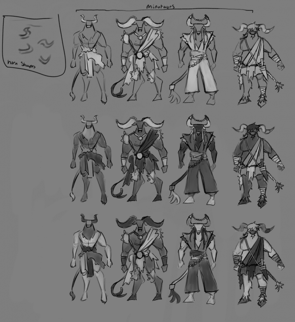
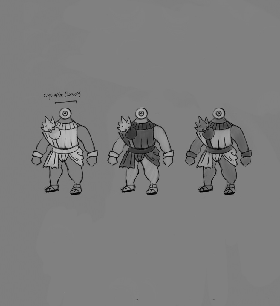
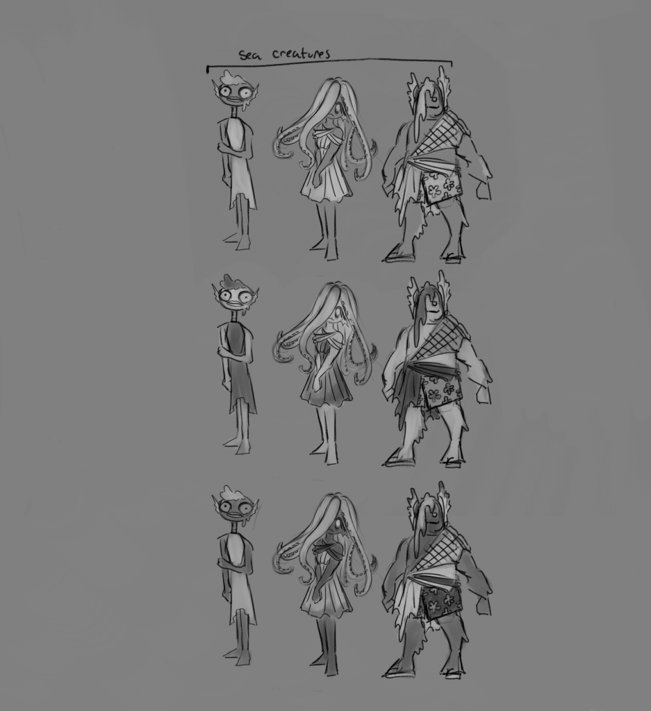
As some of the images I had added were clothing related I was asked if I could create some concepts of audience members, namely various mythological figures such as minotaurs and sea creatures.
These were then coloured in greyscale upon request so the designs would be easier to make out. I did several different iterations for each.
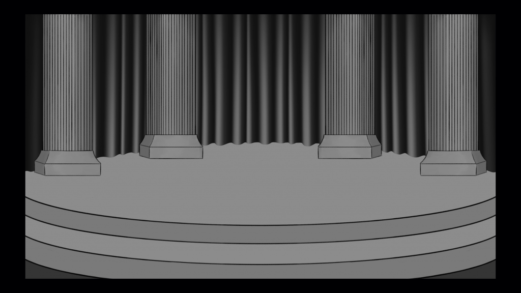
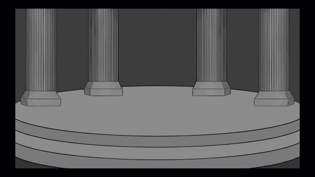
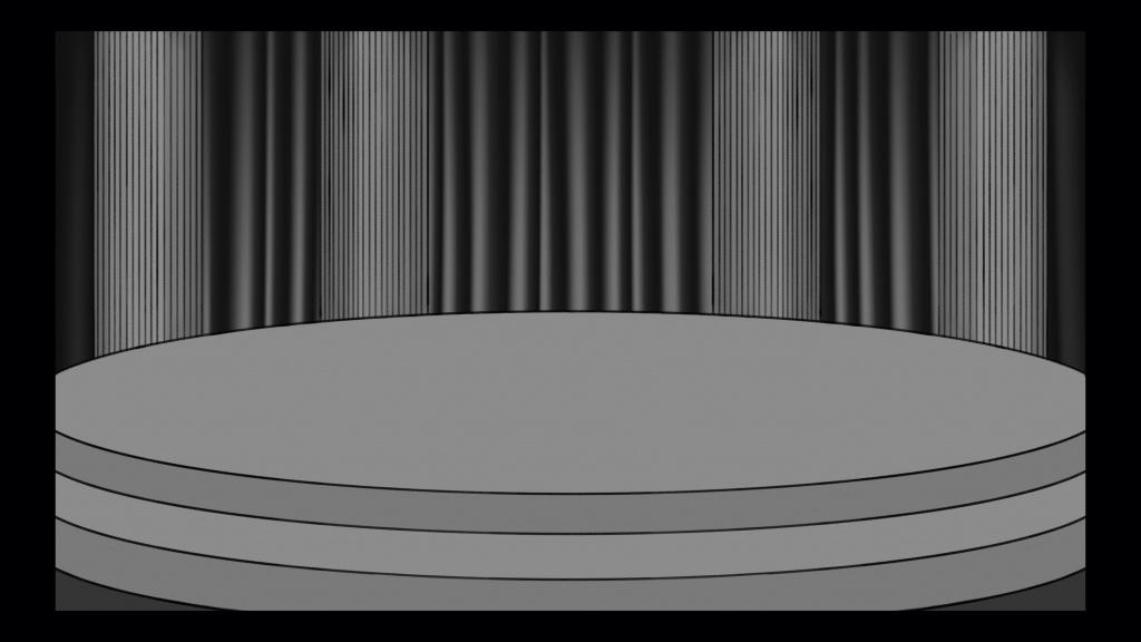
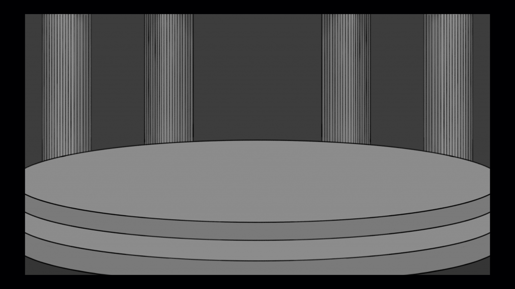
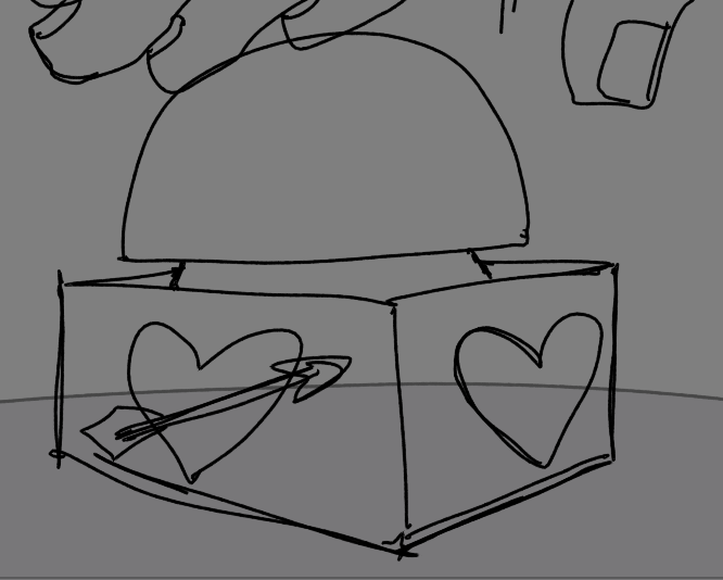
Stage (not used)
I created a stage based on the provided image however ultimately none were used as the message I sent including the files bounced back and a different image was created by someone else instead. This was an important lesson in technology for me and highlighted the importance of double checking messages and files sending before you log off. Moving forwards I will avoid this by making sure any files I need to send are correct before sending them and then ensuring they have gone through afterwards.
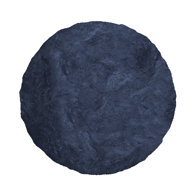
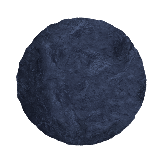
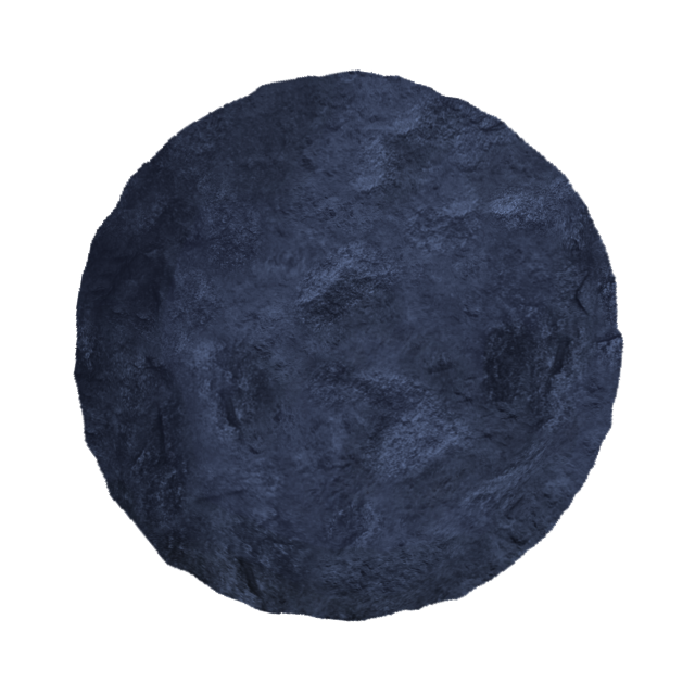
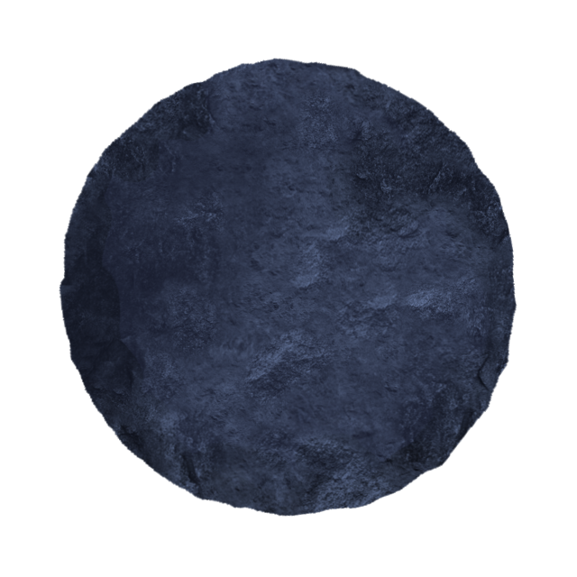
Boulder
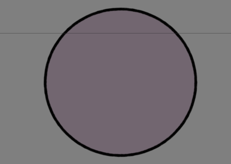
From this moment onwards I only worked on props. The first prop I worked on was a boulder, described to me as being similar to the one in James Bond. It would have 3 different frames of the texture boiling to make it look like it’s moving forwards.
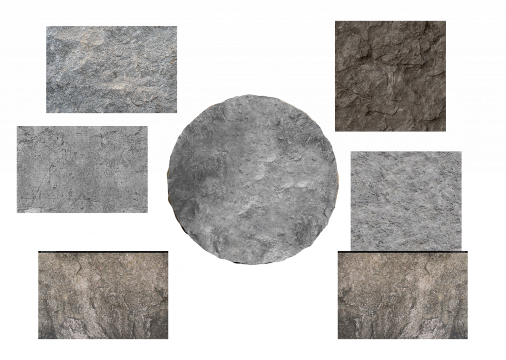
As I am not familiar with animation I had to research into what a boil was and decided on dragging the texture down into 3 different frames as when put into a loop it should make it look like it’s moving (hopefully) forwards). I created this texture by photobashing parts of different boulders to create a custom rock and afterwards dragged it down 2 more times. This ended up working and made the rock look like it was moving. To make this more convincing I changed the silhouette/edge shape of the boulder for each frame by rotating it.
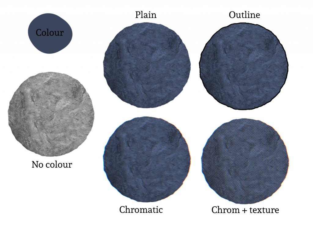
I provided a page with various effects I had tried out, based on the microphone prop I had seen but ultimately we went with the plain version without any effects. I was given specific colours to use for the main colour and shadows. Because I applied the colour using a blending mode I matched it as closely as I could.
Buzzer
The next prop I made was the buzzer based on the below image. I was provided with some colour swatches to base the colours on with the only specification being that it needed to have a red top.
I created 2 variations, one with an outline and one without. The outlined version was chosen as it made the symbols stand out more making them easier to read and understand. The buzzer top was added separately to allow it to be animated.

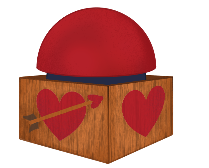
When providing these images it was noted that they were very small. This was because I had based the size on the reference image instead of the standard 1980 x 1020 used for animation. This hadn’t been previously discussed as it was assumed that I would scale up the images but I hadn’t as it wasn’t specified in any of the instructions so it didn’t cross my mind , especially having not worked for an animation before. While I understand where I came from it was a rudimentary mistake that felt very obvious in hindsight and moving forwards on this project and future projects I will aim to double check the desired dimensions for images I work on.
After this was clarified I was able to upscale the images and clean up the edges to remove any pixelation which allowed them to be used at a larger scale.
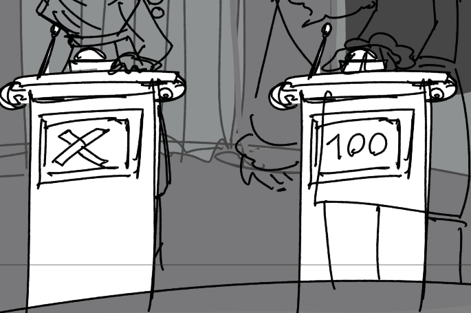
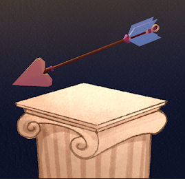
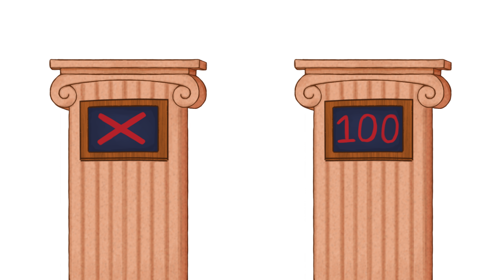
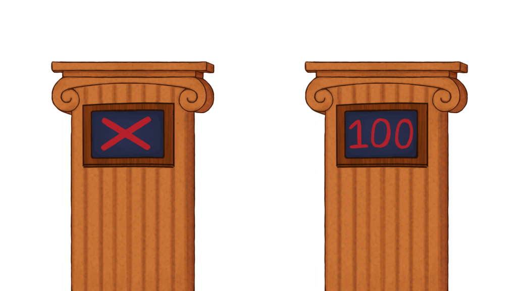
Podiums
The last prop I worked on was a pair of podiums. Like with all the previous tasks I was given a reference image to work from and a specific colour palette. I created 2 colour variations.
Conclusion/Reflection
This was a great project to work on and I feel I was able to learn from the mistakes I made. Due to the style of the project I feel I was able to work more loosely without worrying about small details or any of the work being perfect which goes against my usual way of working. This was a refreshing change and I hope I can carry some of this with me into future projects.